
SongTribe iOS App
Project Type: Visual Design, UX Design, Branding
I’ve recently tried to refresh myself with UX Best Practices by taking a course at UCLA. In that course I worked with a team to create, brand, do a full UX work & pitch an app to investors. I found it especially fun to go out and conduct User Interviews, I like meeting new people and really digging in and understanding what our userbase needed was eye opening.

We are SongTribe
An app that does more than just stream high quality music. SongTribe’s mission is to bring our listeners together through forming communities.
Market Research - Analysis & Pricing

Taking 3 competitors we broke down their strengths and weaknesses and identified what kinds of gaps existed in the market. Then we took a look at their pricing trying to determine what would be a good range for our userbase. We also analyzed what the comparison of tracks vs users was.
User Interviews - Field Interviews


I strongly believe in doing in-field interviews to get to know what your users really need. There’s so much you can learn from getting to know someone and reading their body language that you can’t get from a form. Though not always practical very useful to determine if you can identify some simple gaps and how we can go about solving them.
User Personas
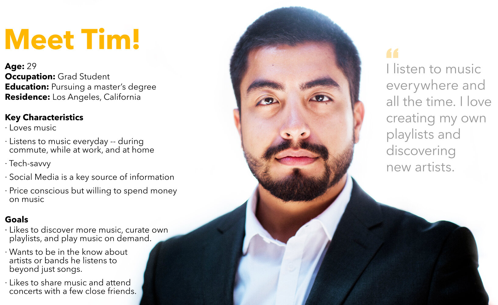

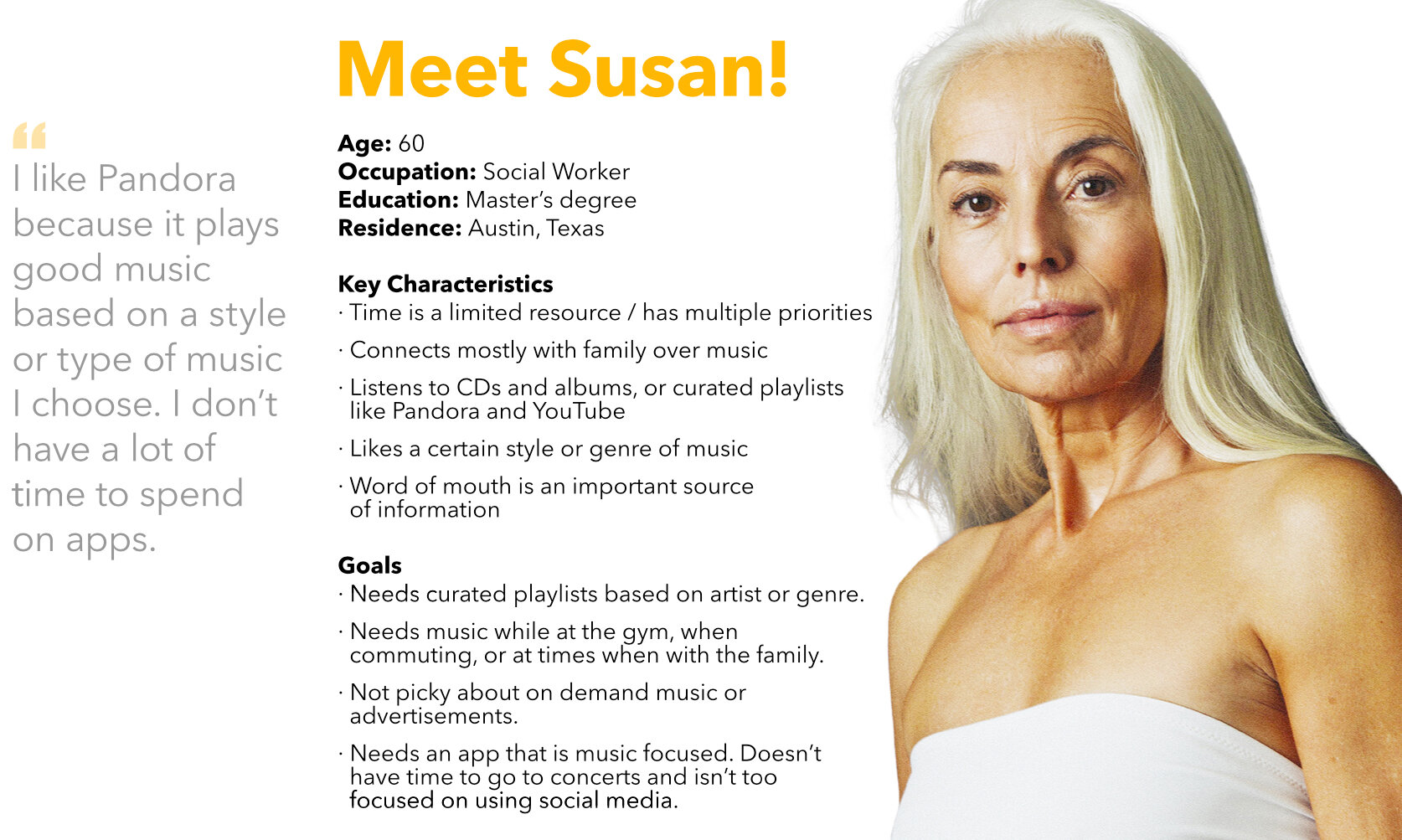
Based off of our collective user interviews we came up with 3 personas: The Music Lover, The Passive Listener, and the Dabbler. I.e. Tim would most likely use our app every day and be connected 24/7 using all of the features we would offer, Alexa would be interested it in maybe a few hours a week, and Susan would if she remembered to use the app.
Card Sorting, Mind & Bubble Map

We identified categories as a team on what features might be useful for our users, then we tested our categories with a focus group. Below are the results.
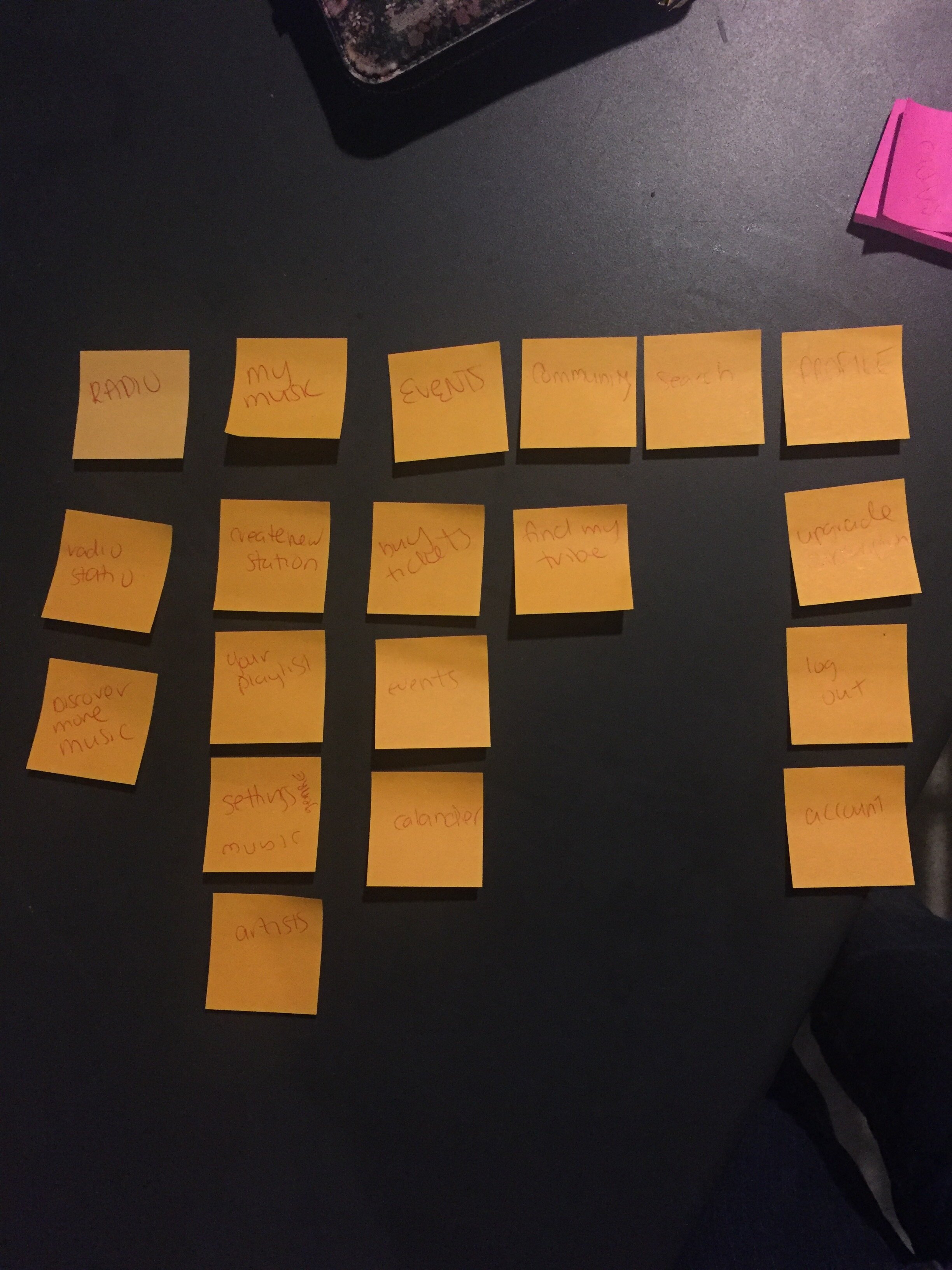

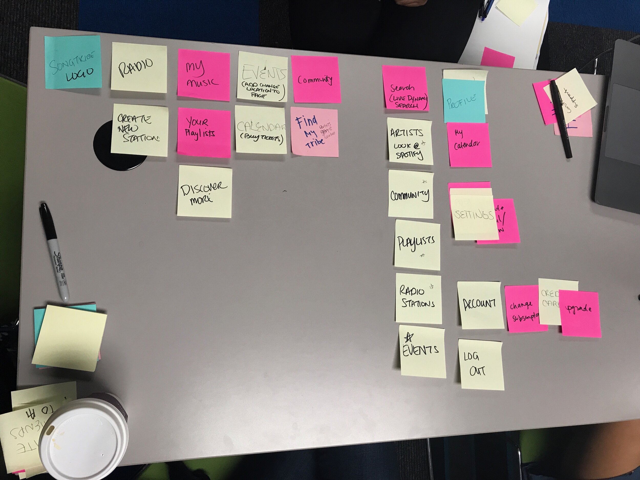

Which led to the Mind & Bubble Map exploration.

Site Map & Userflow

After some more interviews we finally felt good about landing on this site map(above) and userflow(below)

Whiteboard Sketches & Wires

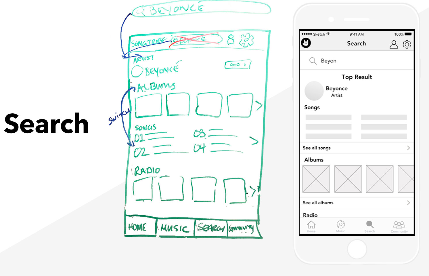
Search feature which included live search functionality and suggestions of what they could listen to.

This was a place the user could go and see what they had played already.

Our app had a social component which would help tie them to the app with the community aspect.

Branding &
Social Strategy
In addition to conducting the UX research and design of our app we also had to come up with a plan on how to rollout our app so we could create buzz and engage people to want to use it.
Logo, Color Palette, Mission Statement


Color Palette (Above)
Logo (Left)

Mission Statement: Find Your Tribe. After conducting many user interviews and knowing that our userbase would most likely skew younger we decided that it would be a good idea to go with a bright, colorful and fun color palette that would also resonate with the idea of being social and going to concerts.
Social Strategy & Launch

This is the general schedule of how we would be posting to our social to drive user engagement. Knowing that our userbase skewed younger the bet was that a lot of our userbase could be reached through social media.

These are some sample social graphics we would use that stays true to our brand but reaches out to engage our userbase and current artists on the platform.
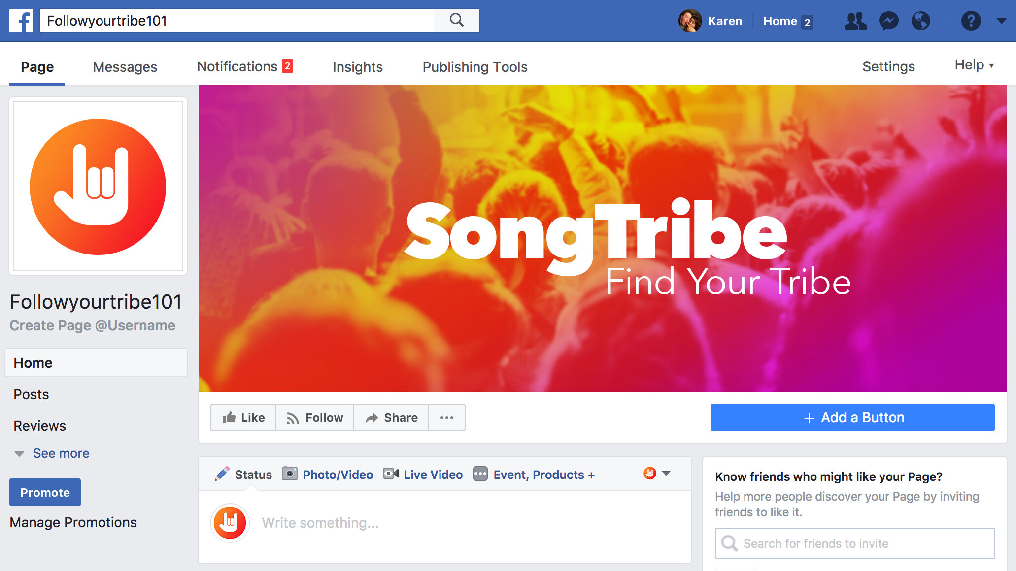
We also created a few social media accounts so we could announce our launch.
Credits
Creative Director, Team Manager & Visual Design: Karen Pedroza
UX Design: Karen Pedroza, Wendy Taing, Amrita Khoshoo
UX Prototyper: Amrita Khoshoo
UX Copywriter & Social Strategist: Wendy Taing